| My print is of a character named Sumomo from an anime. Drawing her onto paper wasn't very difficult, I think the paper version turned out much better than my print. Transferring her to the linoleum wasn't very difficult but my drawing didn't transfer very well so I had to redraw a little bit of it onto the linoleum. For the first part i carved away I carved an outline of the drawing then all of the face except her eyes. The first color i used was pink, because her outfit is mostly pink, for her body. After that I cleaned off my linoleum and carved away the rest of her body, head, and outfit. The next color was black for her eyes and the background. The final step was adding my artistic signature, a "N" and "R" connected. (Similar to my logo) | 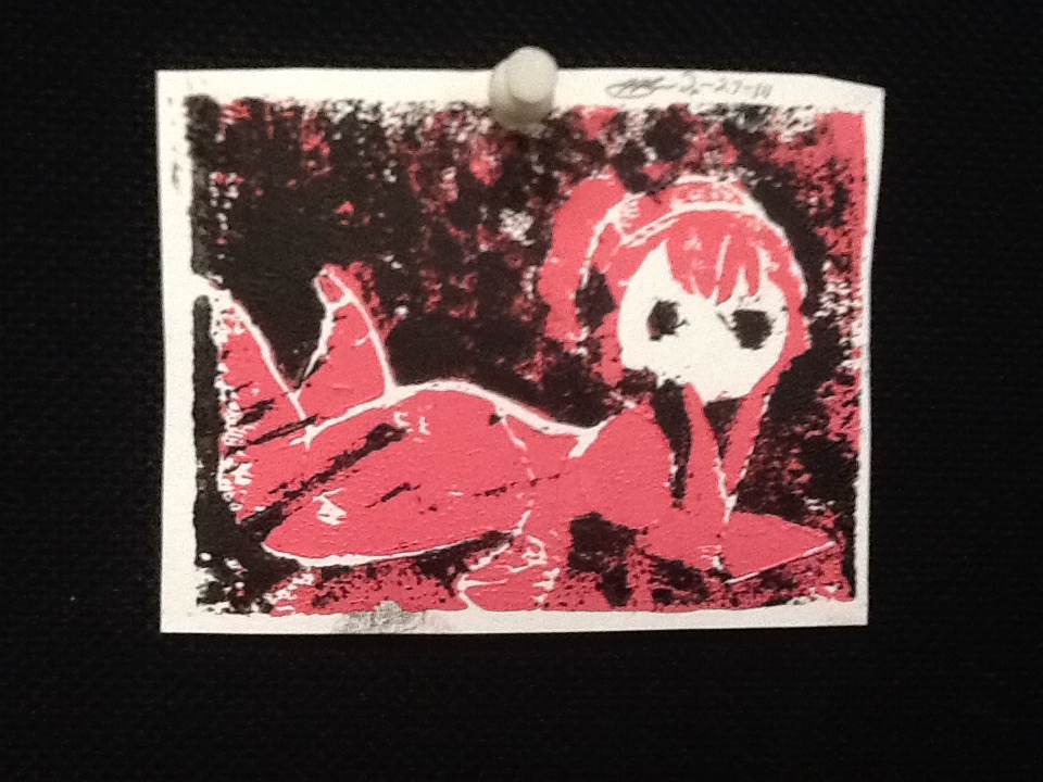 I decided on this design because I really like this character, I've liked to draw these kind of things since 5th grade. From this project, I leaned that printmaking is more difficult than I thought it would be. My favorite thing about this project was getting to understand printmaking better. My least favorite thing about the project was carving the linoleum. |
3 Comments
Please reference my YouTube video for my process. First, I set out all of my cans of paint and other materials. My first color put onto the board wasn't in the video, I started by covering the foam board with white then used blue, a darker blue, purple, pink, and red. After this I put white across the bottom and some stars in random places on the painting. Next I chose yellow, orange, red, green, dark green and purple for the first planet. I used magazine pages to create the texture then put a pan lid over top of the planet to make sure I didn't ruin it while creating the rest of the painting. I touched up the background colors and the stars then flicked white specks onto the painting to create smaller stars. Next I created the second planet using green, dark green, purple and pink then created texture with the magazine pages and put a pan lid over the planet. I touched up the background again and the white across the bottom and flicked more white onto the painting. After this I began the bottom using blue, dark blue and black then added more texture with the magazine pages. Finally I put more black to touch up the bottom and some white specs for smaller stars. In the bottom right corner I added my signature then flicked on a few more stars and took the pan lids off. I am most proud of how the bigger planet turned out.
1) What project did you choose? I chose Twisted Reality. 2) Why did you choose this project over the other project? I like to draw and i thought it would be fun to draw something i've never drawn before. 3) What are you most proud of from the final results? I am most proud of my drawing. 4) What apps did you use? Sketchbook? Pic Shop Lite? PS Express? The apps i used are Sketchbook and Pic Shop Lite. 5) Tell me what you did in the app? Explain the app and how to use it as if you have never used it before. Please include Screen shots of the app! In Sketchbook i traced and colored my drawing then in Pic Shop Lite i edited the picture. 6) What did you LIKE about using Voice Thread and getting feedback from UNI students? I liked that I was able to hear the UNI student's voice instead of just seeing text.
|
